

Dear fellow typo socialists, I need your advice.
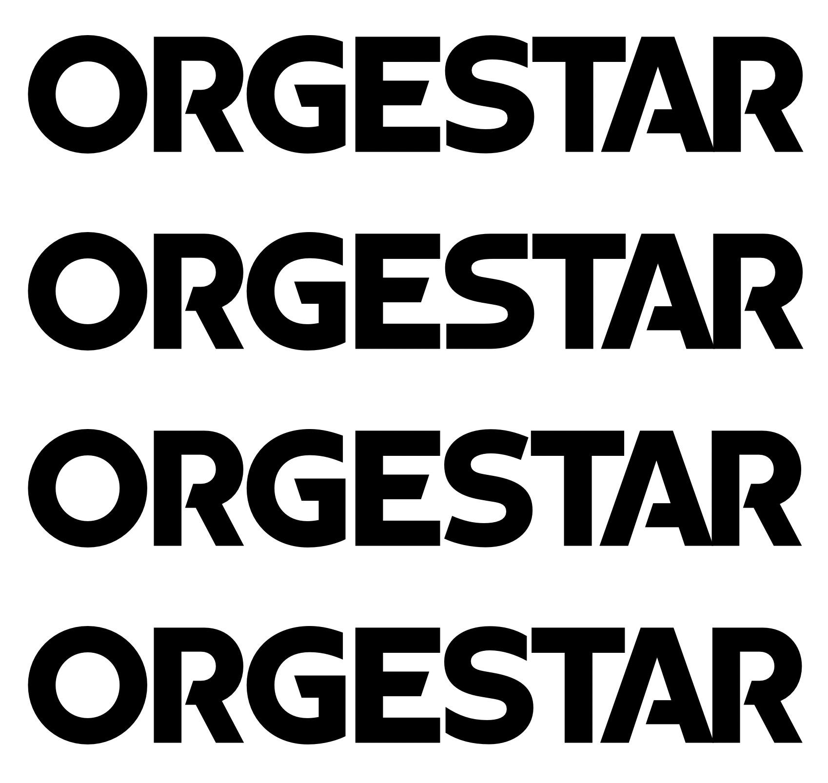
I made a weird logo way back and try to make it into a display font for the client now.
But the S always looks misplaced. Has troubles to match the constructed, solid flavour of the rest.
Which one works best for you?
I made a weird logo way back and try to make it into a display font for the client now.
But the S always looks misplaced. Has troubles to match the constructed, solid flavour of the rest.
Which one works best for you?
1
