We know the rise of the Greens & ReformUK Ltd has shifted voters away from supporting the Labour Party. The Economist used these results to match the age & work profile of workers to map this transition between 2021 & 2026.
The diagram below offer a (further) stark demonstration of why the Labour Party is wrong-headed in their aping of ReformUK, not least because their support from such wider base is moving to the Green Party of England & Wales.
#politics #Greens
h/t Andy Cotgreave/LinkedIn
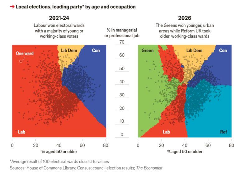
The diagram below offer a (further) stark demonstration of why the Labour Party is wrong-headed in their aping of ReformUK, not least because their support from such wider base is moving to the Green Party of England & Wales.
#politics #Greens
h/t Andy Cotgreave/LinkedIn
3