Damus
Tess · 69w
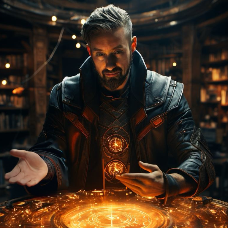
One but theyโ€™re all cool
JD · 69w
1st
Coinatra · 69w
1st one, but 4th has a really clean style to it. ๐Ÿ”ฅ
Nostr Gang · 69w
The last one
Matte93 · 69w
First one
MBman2024 · 69w
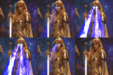
3
0000FFmoongirl · 69w
when a word, like "nostr" is new to someone, they may find that more stylish representations (in this case, elongated letter forms) are harder to parse into recognized letters, so they can decode them as letters, and assemble them into this-new-word-I'm-just-now-learning. the extra parsing effort ...
Vultura · 69w
why is purple ?
0xD43m0n · 69w
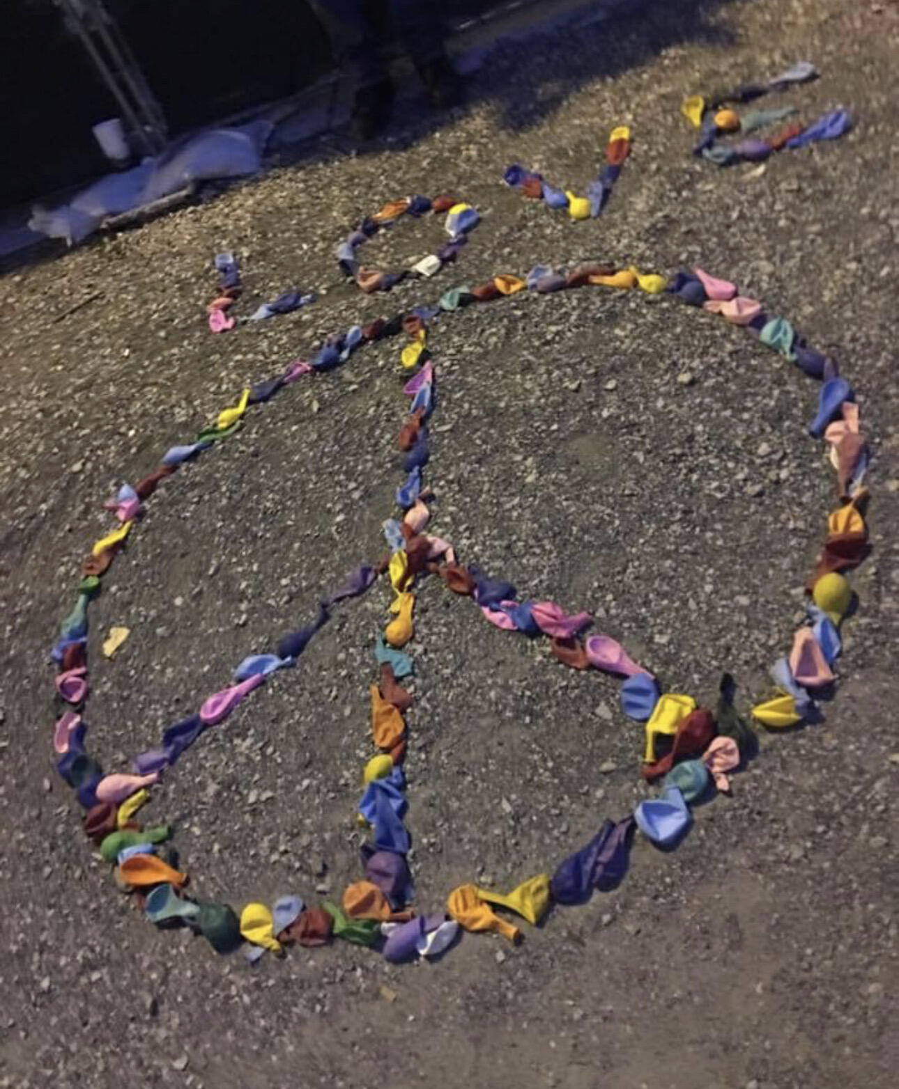
1 & 2
Rich Lassiter · 69w
The first
Sarahโšก๏ธ · 69w
Last one
nostrich · 69w
Second one, very 60s. Groovy baby
Dave๐Ÿธ · 69w
Easiest read: last Steezus: third ๐Ÿ”ฅ
deeznuts · 69w
4
Silas Thornbrook · 69w
1 - love the shade of purple also
Bitcoin and Clyde · 69w
4 ๐Ÿค™
Universal Bunny · 69w
The last one.
Economista Austriaco · 69w
4
Common Sense · 69w
4 2 3 1
Speedy · 69w
1 and 4 but 4 is my favorite.
Johntoshi Nashimoto · 69w
2. Ha der to read, but also less obvious
Leon · 69w
#1 ๐Ÿ˜Ž
Thomas · 69w
The last one. Best to read.
satskew · 69w
i like numbers 1 and 4
SecretAIry · 69w
The last one. (agree with Thomas) The others look more like a piece of art, and are hard to read. So it might depend on your intention... what you wanna use it for?
Swanny · 69w
I liked #2 the best
Jason SatSki · 69w
The 3rd
Bill Monroe · 69w
i like 1
Z0M8I3D 3D · 69w
#3
marp · 69w
All dope.
๐™ฐ๐š‰๐™พ๐š ๐Ÿฅท · 69w
1 ๐Ÿค™
โ‚ฟoniz23โšก๏ธ๐Ÿดโ€โ˜ ๏ธ๐Ÿ‡ฎ๐Ÿ‡น · 69w
2 ๐ŸคŸ๐Ÿดโ€โ˜ ๏ธ๐Ÿ˜‰๐Ÿ’œ
sandwich · 69w
All of them.
Aaro · 68w
3
imnuso · 57w
2
negr0 · 57w
La รบltima
arkinox · 57w
๐Ÿ’ฏ https://m.primal.net/PvUp.png
Onyx๐Ÿ–ค · 57w
1 and 4
Bitcoin Samurai · 57w
NUMBER ONE!!! The balance is the best.
NaturalNerd · 57w
Number 2
not pascal · 57w
I like 3 and 2. From an aesthetic point of view, I like #2 better. If you want to give normies a chance to decipher the lettering, then you should go for #3.
โ‚ฟharat · 56w
#3 ๐Ÿ‘Œ๐Ÿฝ
mango · 56w
#1
Max DeMarco · 56w
2 is sickk