Damus
SoapMiner profile picture
SoapMiner
@SoapMiner
🚨 SATS GIVEAWAY 🚨

210 SATS TO FIRST 21 NOSTRICHES THAT REPOST, AND GIVE ACTUAL ANSWER IN COMMENTS. I NEED REAL FEEDBACK.

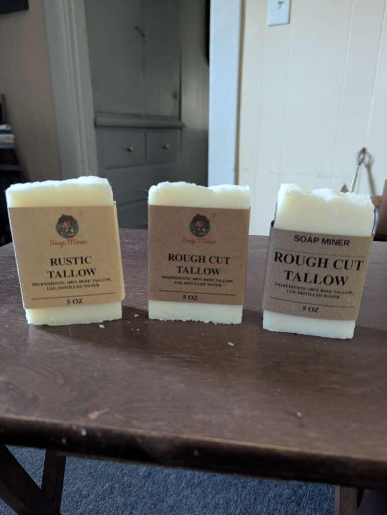
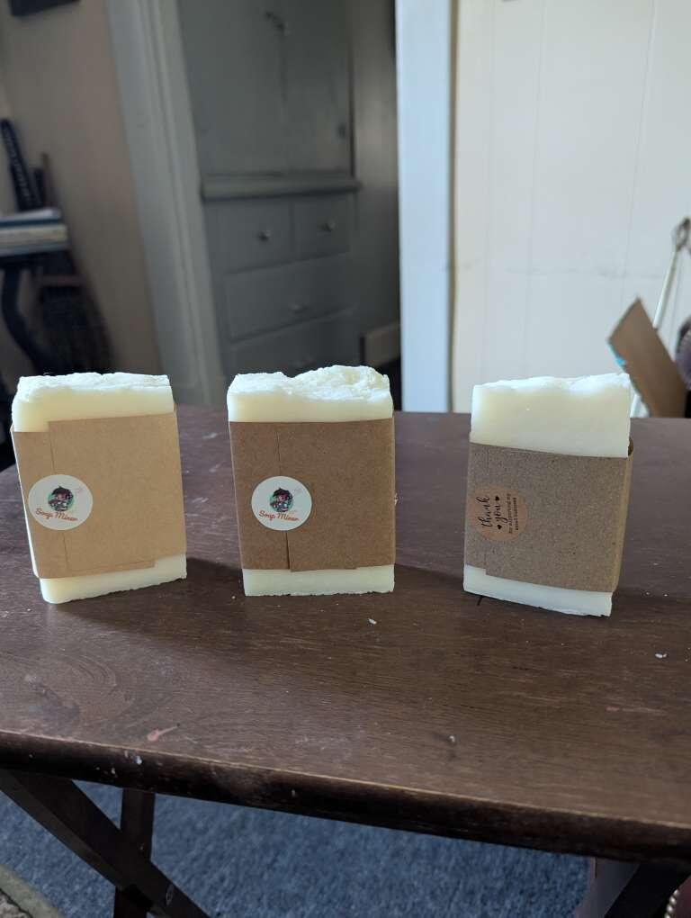
WHICH PACKAGING LOOKS BEST OUT OF THESE THREE? LEFT, CENTER, RIGHT?

ONLY FIRST 21. Everyone else gets 21 Sats. Those are the rules. 🤷

6825❤️16❤️5🤙2🍆1👀1👍1
🟠 isolabellart · 58w
The one on the right is simpler and more elegant. Very nice.
Natroncar · 58w
Descartaría el de la derecha
John Smith · 58w
center, but make sure the 5oz is centered xD
Bitasso · 58w
You’re a soap company, keep it clean. Padding is off (live area is too close to the edge due to inconsistent label trimming), print yourself crop marks. Leading on the large type needs work. Fonts could definitely use a rework. All caps could work but use sans serif if you’re going that route....
Oshi (推し) · 58w
Og one.
JoJ · 58w
I like the right
dagwood · 58w
Maybe do one in a hemp mesh bag that can hang in the shower so the soap doesn't go manky. https://m.primal.net/Pesq.jpg
David · 58w
Left>Center>Right, I like the logo personally
dylan · 58w
Center at first glance but I think I’m primarily drawn to the logo. If you can work the logo into the right, I think that font layout is a little more appealing. Cool stuff either way!
MF MOON · 58w
Right one looks best to me, I agree with what nostr:nprofile1qqsph6fjv9504a84auv8wz43v0lzcf4uqjwjz2vpscmhehqr80mfv9qpzfmhxue69uhk5mt0daek2tnjda3kkucpz3mhxue69uhhyetvv9ujuerpd46hxtnfduq3yamnwvaz7tmsw4e8qmr9wpskwtn9wvlwk7yh had to say
hayden ⚡️ · 58w
Id say the left is my preference out of the 3. Most aesthetic and premium feeling to complement the product.
hitheringwaters · 58w
Left
Caballo Alazan · 58w
Don't like size of font on right. Prefer middle with darker paper. Offsets light color of soap. Left might be a bit too delicate.
Mel · 58w
#2 second pic
Mel · 58w
OK, let me be more specific for you the first one I don’t know what rustic tallow is so I would immediately be confused if that was on the shelf number three I liked better, but the letters are too far apart for me and it doesn’t look like a beauty product. It looked like maybe something that yo...
dreampiercing maya · 58w
I like the idea behind the third one, but visually i prefer the first one.
renato · 58w
Left
Jamie · 58w
The left sticks out, but I think the product name font should be larger.
hasky · 58w
like the one with the logo
Nick tuner · 58w
Right 👍
stacymaloba · 58w
Right
Michael S Wildcard ✨ 😶‍🌫️🗽⚡ · 58w
I prefer the one on the right. The soap miner is too small on the others.
PalmTree 🌴 · 58w
I also prefer the one on the right.
1GLENCo · 58w
I like the one in the middle. Not sure why. I'm too tired to put together words to explain. Just letting you know that's where my preference is.
Dennis Moody · 58w
Left one- everyone gravitates to packaging with logos/pics…
Farside · 58w
I like center. However I have a concern. If it gets shipped in a hot truck, or gets bought and sits in a hot car on the way home for any length of time then it's going to make a big mess if that is the only packaging that it will come in.
VikiSecrets · 58w
Left
Satoshiii ˗ˏˋ⚡︎ˎˊ˗ · 58w
👏
Decentralizedaz · 57w
Right one catch the eyes and makes remember fastest.
SuiGenerisJohn · 32w
Right for me for. Plain and striking.
Aldocstr · 32w
If your target is Men definately the right, looks like buying from a military surplus store, rugged, direct and made to get the job done
Adrian M Lopez · 32w
Take the color of the middle packaging and combine it with the right’s design. Perfection.