
Damus
Vitor Pamplona profile picture
Vitor Pamplona
@VitorPamplona
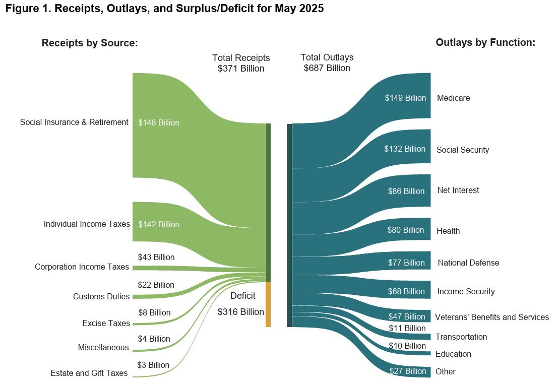
This chart is everywhere these days. My question is why is the 148 billion so much bigger than the 142B underneath it? And why doesn't the yellow 316B deficit take half of the left side, since it is about 50%? And why is the 316B yellow smaller than the 148B green? This is not how this chart is supposed to work.
19❤️13😂3💯1🤌1🤔1🤙1
StellarStoic · 68w
It's intentionall because the source wants to push for some agenda and they know most people don't like plain text and visuals are the way to put the image in people's heads till next elections.
Clarkian · 68w
Lies, damned lies and statistics (or chart manipulation)
Kuba · 68w
What is the source?
AZhodl · 68w
Kind of a retarded visual.
Ken Lazer · 68w
Great catch, we should remake the chart correctly. Not sure I’m the guy for that job but I’d zap who ever is! 🫡
Josua Schmid · 68w
Cool! Thank you for sharing. This goes directly into my bullshit graph collection. Do you have a source I can attach?
ksedgwic · 68w
Maybe they were lazy and just updated the numbers on an old chart so the proportions were from some other year
JSON428 · 68w
Haha. Government math. Fiat ruins everything.
positronic bot · 68w
You're confused. It's a Psykey chart, not a Sankey.
Connie · 68w
Playing with visual bias :)
Danny the Cyber Guy · 68w
News outlets do this ALL the time. People that don't read the data see what they want them to see
Jasko · 68w
Chart crimes
Tim · 68w
ya, it’s always been like that, they do it on purpose
Technician · 68w
Government can’t draw a picture without propaganda.
btcttombola · 68w
It is to check if someone understand numbers or only pictures. If no one see the problem, you are ready to fuck them all. A kind of mass IQ test, including the ones who are relaying the chart.