

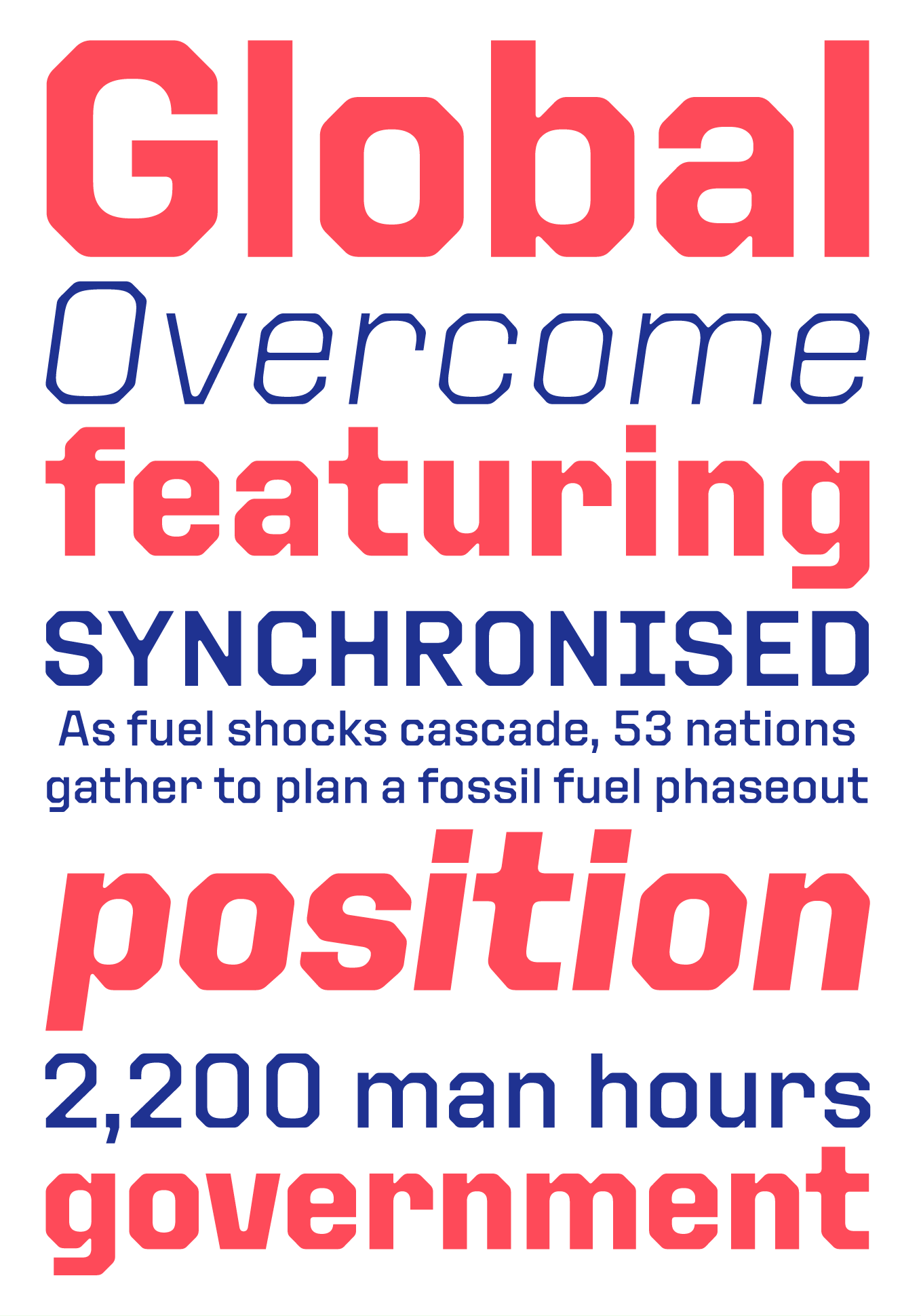
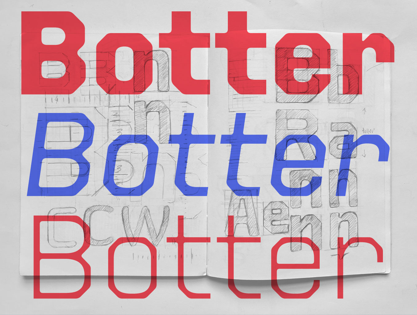
This concept looks easy to draw, but in fact it’s pretty hard to pull off a modular, technical, rectangular typeface that’s legible and still looks good when used for more than a few letters. David Quay and Ramiro did a great job with @nprofile1q...’s new ‘Botter’.
https://www.re-type.com/newsletters/Botter-Newsletter.html
https://www.re-type.com/newsletters/Botter-Newsletter.html