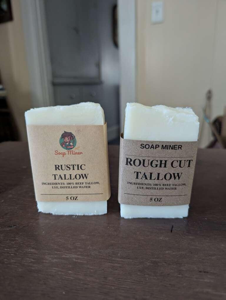
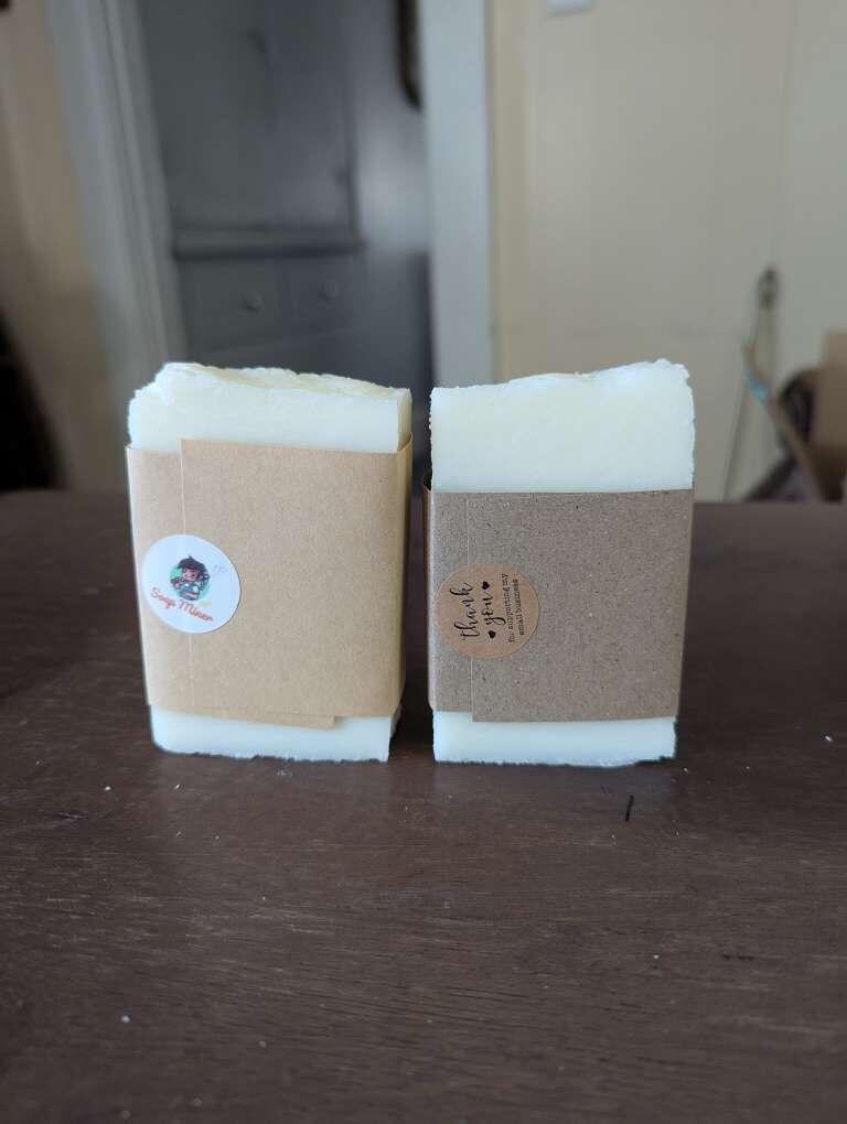
Damus
SoapMiner · 58w
🚨 Sats giveaway 🚨 First 21 Nostriches that respond, and repost this get 210 Sats. Want real opinion. Going to try new packaging. Which is better, more attractive, a superior quality? Left, ...
Baked Potato profile picture
🚨 Sats giveaway 🚨

First 21 Nostriches that respond, and repost this get 210 Sats. Want real opinion.

Going to try new packaging. Which is better, more attractive, a superior quality?

Left, or right?
199❀️6❀️1🀩1🧑1
Yarnlady 🧢 · 58w
Keep the sats. I like the simplicity of the one on the right.
ButtercupRoberts · 58w
Depends on who this is for. Love the little logo from the one on the left, but the right one speaks more to attractive, superior quality and give you a more β€œserious” brand. 🀠
Studio 3.14 Official · 58w
I like the one on the right.
Mark πŸ’βš‘οΈπŸ«‚πŸ’œ · 58w
Left looks good πŸ˜€πŸ‘
HOLDER · 58w
Left for sur
SMITH HOLDER ❀️ · 58w
Left βœ…
Bitcoin Burger · 58w
The right version looks more clean and valuable to me.
QW · 58w
Right.
DJ · 58w
Left
π–“π–”π–Šπ–—π–’π–˜ · 58w
LFG!
π–“π–”π–Šπ–—π–’π–˜ · 58w
Left πŸ’―
β‚Ώlank ⚑️丰 · 58w
Right
Dan · 58w
Left
nerdydragon · 58w
Left. Good mix of text and imagery.
@IsabelSydow Queen of Shrimps (but u can call me Dan.) · 58w
Is it possible to make the logo bigger from the one on the left???
Matt πŸ›Έ · 58w
Consider a different font for the branding on the right. I like the rest of the look, it just isn't clear that soap miner is a brand on that one. Maybe try the font from the left without the image.
Decentral · 58w
Right looks nice
Sats McJay · 58w
Left
Marc · 58w
Left
Neo ⚑️ · 58w
Right
Arotags · 58w
Left. I also think stacking the ingredients would be visually appealing to display how simple the ingredients are.
NewAtlantis · 58w
Got any of them sats mate?
Winn · 58w
Right