Damus

Recent Notes

Monokrom profile picture
Very funny that @nprofile1q... thought we were Dutch. I humbly accept the typographic honor. Others struggled to understand how many new typefaces were released (what is it even to release a typeface?), or focused on limited character sets (which are very intentional choices).

I think this new website breaks a lot of expections about what a type foundry is, and does, and IMO there are really no design critique platforms out there equipped to dive deep enough into it to convey what is going on. In the attention economy, it will remain just a tiny blip. This is what we are expected to serve the audience: bite sized nuggets.
Monokrom profile picture
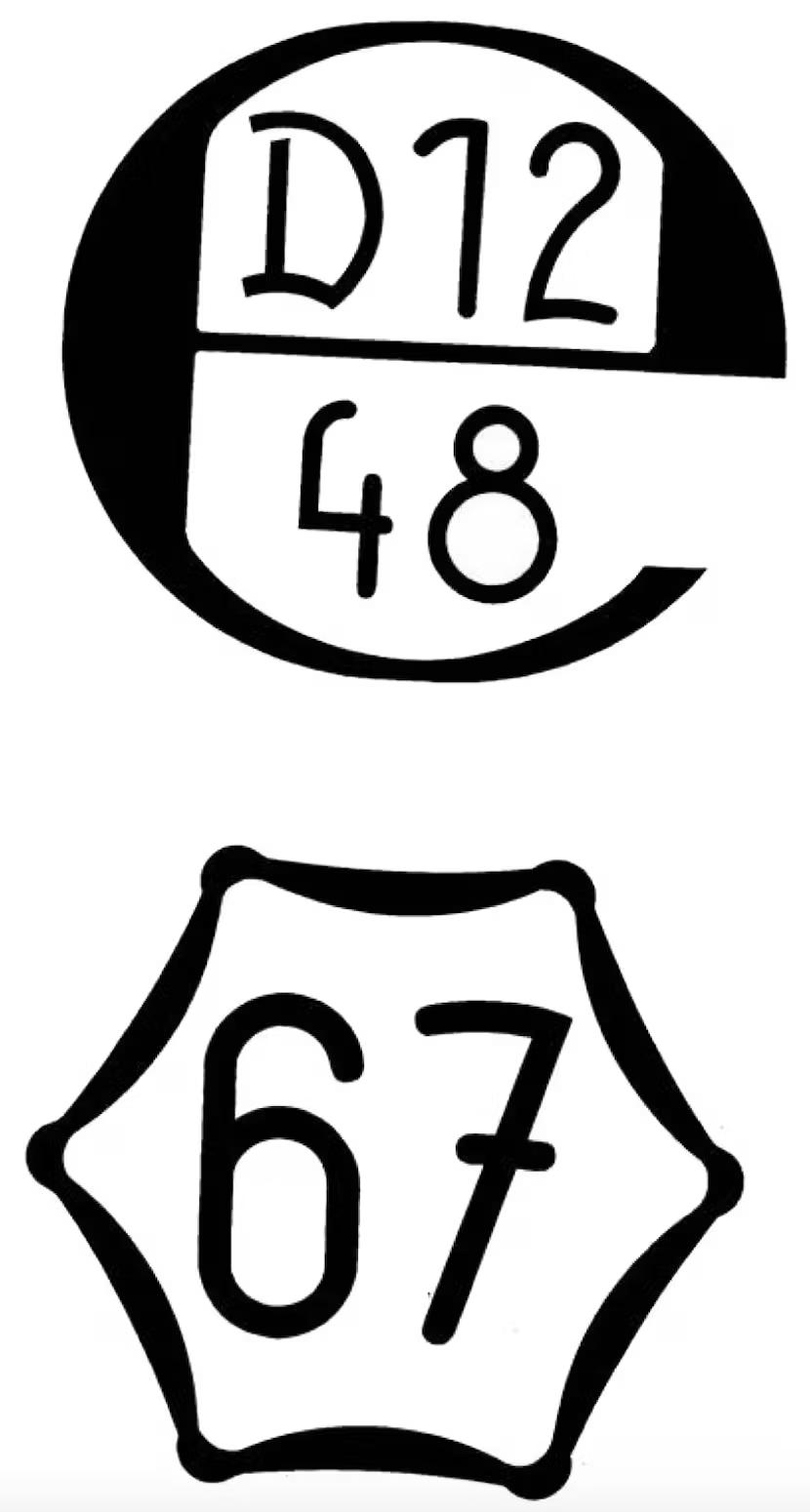
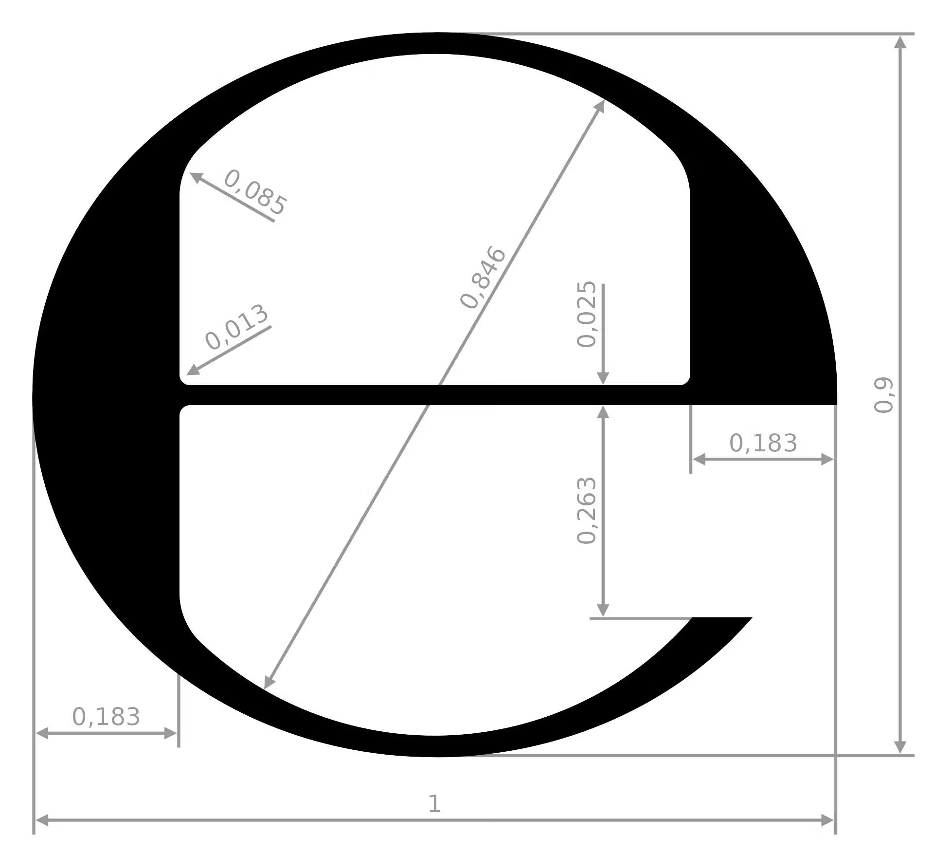
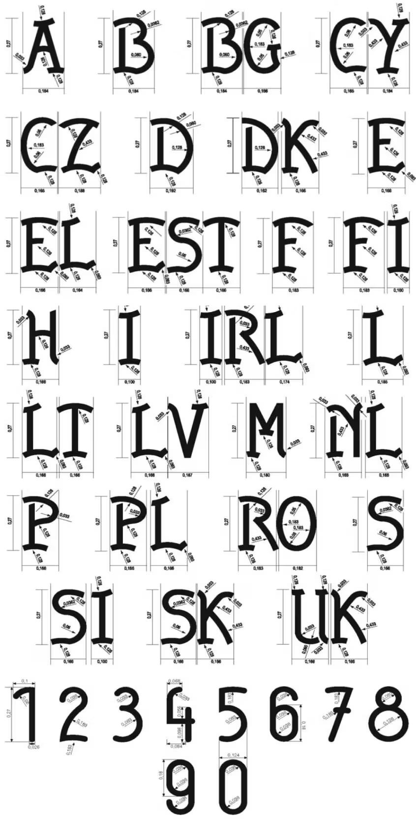
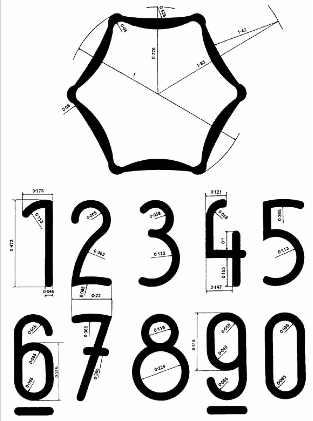
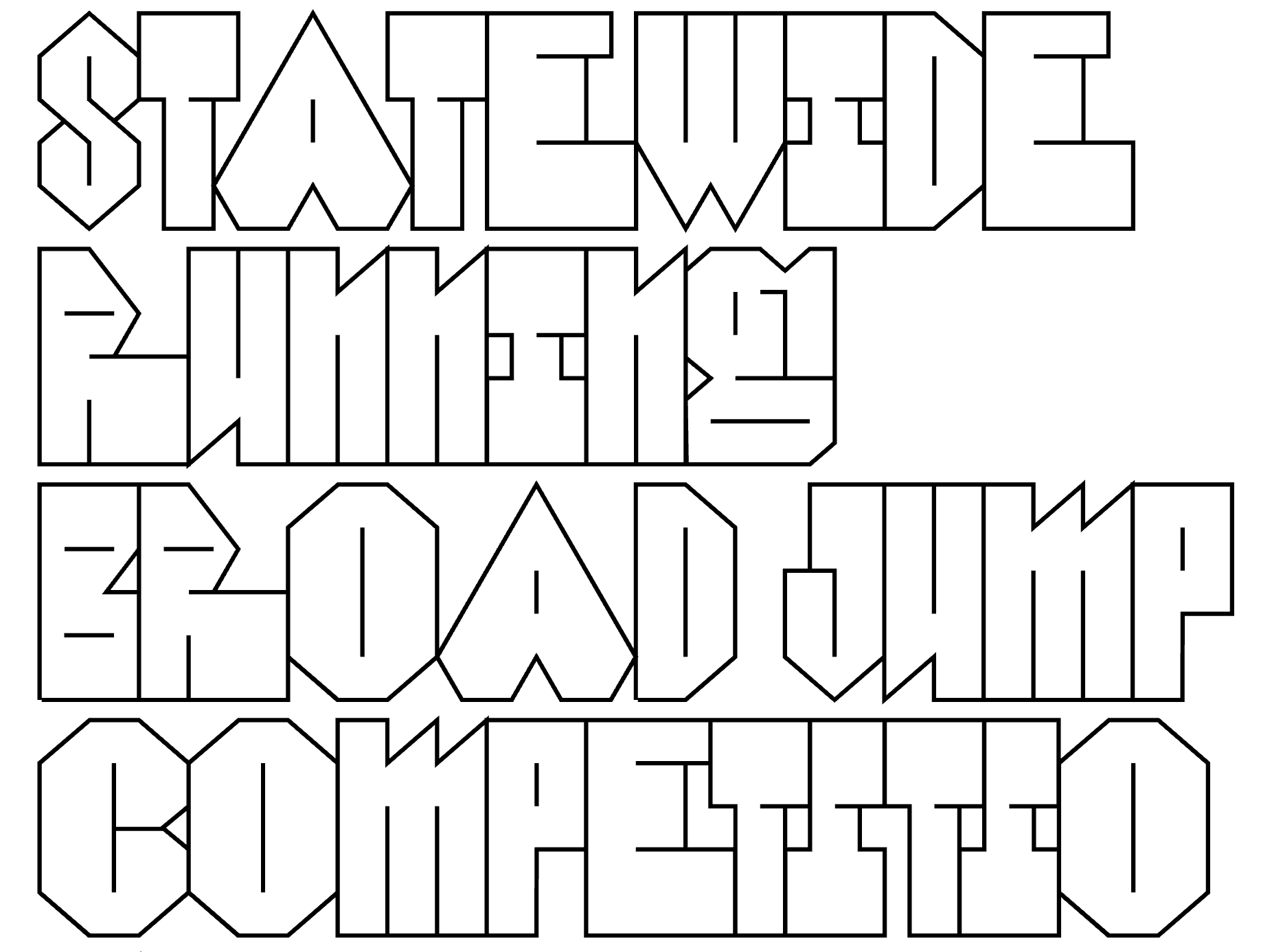
New release: The Estimated typeface derives from a limited set of alphanumeric characters that accompanied the estimated sign (℮) at its introduction by the European Economic Community in July 1971.

While the symbol entered everyday use, the strange ornamental sans serif fell into obscurity. The uncredited schematic drawings approach blackletter capitals morphologically, but their naive execution leaves an uncanny impression. The numerals are simpler constructions, with rounded terminals drawing from industrial draft lettering. Alongside the obtuse ℮-mark and the alien-styled hexagon, the typeface appears less like the domain of gray bureaucracy, and more like the decals of an experimental Skunkworks project.

https://monokrom.no/typefaces/estimated


Monokrom profile picture
The new Monokrom website contains a mountain of essays, articles, biographies, visual references, characters, typefaces, and data - tons of it. Everything comes with notes and a reference list. Each entry has a byline with publication date and date for the last update, allowing others to reference. There are bound to be errors and misunderstandings, but the sources are open and easily checked. All of it is produced without artificial intelligence.
Monokrom profile picture
I would like to have a section in our EULA about what we promise to deliver, and struggle to quantify what is expected from a font file beyond following the OpenType spec. Wordings like "according to contemporary/current standards" seems very vague. Can you point to good examples of type foundry EULAs that address this?
Erik · 15w
nostr:nprofile1qy2hwumn8ghj7un9d3shjtnyd968gmewwp6kyqpqz977x5pcrt93pf0pdvrw2t0dn90ux8der7qj6nf4vy3djtcuasushakvst nostr:nprofile1qy2hwumn8ghj7un9d3shjtnyd968gmewwp6kyqpqkqk6un92qp0fs6ry6sc5nsywgkzdsezw4dxjr6st3uurd7h5ntsscsnst7 That g is ✨
Monokrom profile picture
Picked up some language materiale from a church sale: The nugget among them is the Lingala New Testament (printed in Kinhasa, then Léopoldville, 1965), which specifically cites the author as “Our Lord Jesus Christ”.
1
David Sudweeks · 20w
nostr:nprofile1qy2hwumn8ghj7un9d3shjtnyd968gmewwp6kyqpqz977x5pcrt93pf0pdvrw2t0dn90ux8der7qj6nf4vy3djtcuasushakvst He wrote that one? If it checks out, I’ll have to add it to my very short list of things he wrote: 1. Ten Commandments 2. Four words on the wall at Belshazzar’s feast 3. Unknown writ...
Monokrom profile picture
What is the story behind Unicode encoding upper and lowercase characters as parallell hex ranges in groups of 32?

A (U+0041) > a (U+0061)
B (U+0042) > b (U+0062)
…

And: Are there any benefits to following this logic when planning your own PUA encoding?
1
Tiro Typeworks · 22w
nostr:nprofile1qy2hwumn8ghj7un9d3shjtnyd968gmewwp6kyqpqz977x5pcrt93pf0pdvrw2t0dn90ux8der7qj6nf4vy3djtcuasushakvst To answer your second question. There’s no technical benefit to having a PUA encoding with parallel ranges for upper- and lowercase, but it can be helpful for people implementing the e...