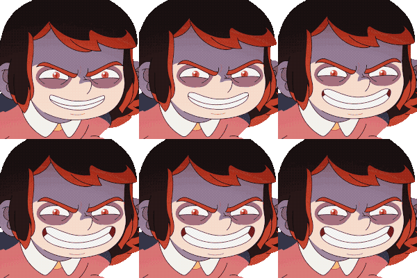
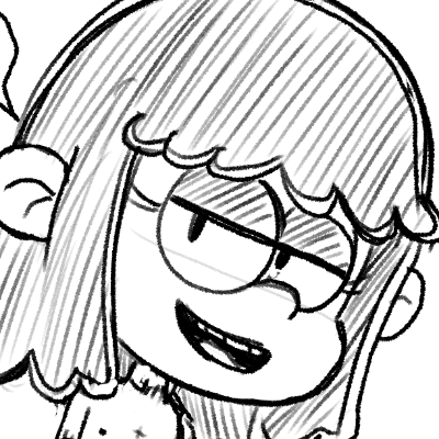
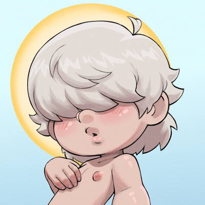
@nprofile1q... It's the line weight, if all of your lines are of the same intensity then they're all competing with one another and this makes your work look flat.
There's a few things that can help with this First, you need to modify the pressure sensitivity of your brushes so you can apply lighter lines to less important elements and direct the viewer's attention where you want it to go
If your pen control is lacking you can always clone the brush and modify the size and pressure sensitivity