Damus

Recent Notes

Typographica profile picture
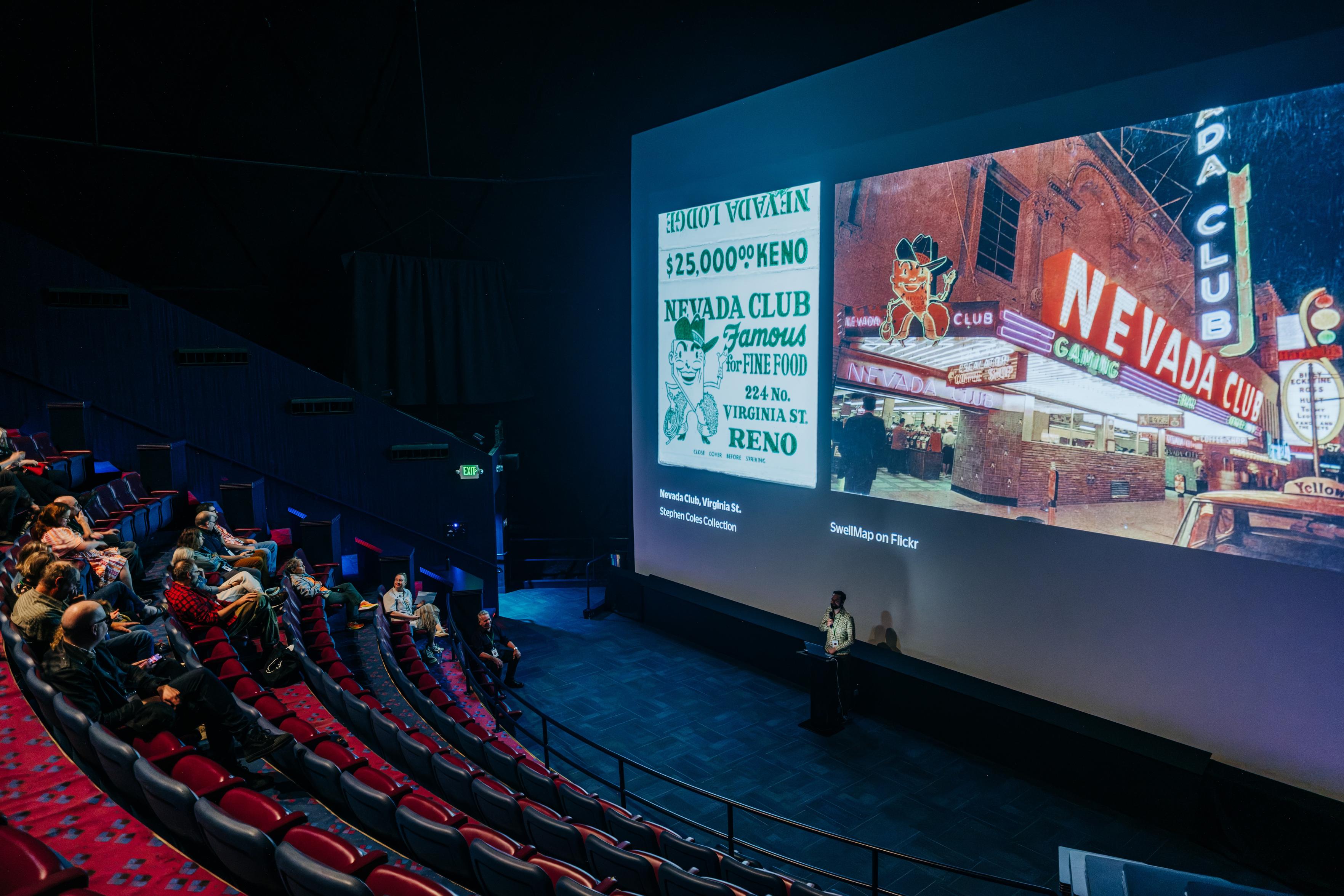
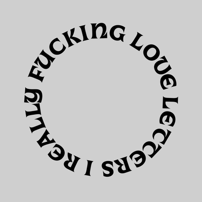
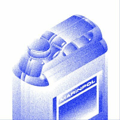
Last week the Neon Speaks festvial was held in Reno at the soon-to-open Light Circus Neon Museum hosted in the National Bowling Stadium(!). As soon as we saw the size of the building’s theater screen I knew we had to do a matchbook talk so we could blow these beauties up to ridiculous sizes. What fun!

Photo: Francisco Chavira

More images soon.

Doug Wilson · 8w
nostr:nprofile1qy2hwumn8ghj7un9d3shjtnyd968gmewwp6kyqpqg8368dx0n6g2c5hdmpak8eukstmgc44v9p5h4am93u3qeanrqdzqejqecv nostr:nprofile1qy2hwumn8ghj7un9d3shjtnyd968gmewwp6kyqpqc046qlt3y042znxt36vvxs4f2la6tfd5a0ql8edpqxxvq6ypqxfqmuk2c8 Did you know this, nostr:nprofile1qy2hwumn8ghj7un9d3shjtnyd968gmewwp6kyq...
Ando 🔠 · 11w
nostr:nprofile1qy2hwumn8ghj7un9d3shjtnyd968gmewwp6kyqpqg8368dx0n6g2c5hdmpak8eukstmgc44v9p5h4am93u3qeanrqdzqejqecv Thank you!! Funny enough, the way I learned about this font was from the Witcher haha https://www.gamefontlibrary.com/games/the-witcher
Typographica profile picture
“One of the many truly offensive things to me about AI-driven artistic processes is that they divorce the ostensible artist from their influences. All art draws on and builds on previous work in one way or another, and an artist had ought to be aware of their influences, and ideally share information about their influences with those who see their art. When you use AI, it obfuscates the sources of the ideas it shows you, and as a result you release things completely severed from their history and context, which is bad for everyone involved.” — qwerasd205 https://typedrawers.com/discussion/comment/71764/#Comment_71764
1
Faux Icing · 14w
nostr:nprofile1qy2hwumn8ghj7un9d3shjtnyd968gmewwp6kyqpqg8368dx0n6g2c5hdmpak8eukstmgc44v9p5h4am93u3qeanrqdzqejqecv Thanks for sharing this! AI aside, I do have some thoughts about the redrawing of typefaces. Let's say if a person do really enjoy a particular font but finds the cost of a font to be o...
Kent Lew · 18w
Timeless question: “Can it be ... that there are too many type faces for printers and advertisers? It appears, upon inquiry, that there are. It appears that a goodly number of discriminating compo...
Typographica profile picture
@nprofile1q... Yeah, I found it funny that their main point of the exercise was that it’s past time to toss all the "less useful" typefaces, while I’m over here for the last 20 years preaching typographic abundance.

To be fair, type back then actually occupied valuable space.
2
Kent Lew · 18w
nostr:nprofile1qy2hwumn8ghj7un9d3shjtnyd968gmewwp6kyqpqg8368dx0n6g2c5hdmpak8eukstmgc44v9p5h4am93u3qeanrqdzqejqecv Now it just occupies valuable font menu dropdown space. 😉
Thomas Phinney · 18w
nostr:nprofile1qy2hwumn8ghj7un9d3shjtnyd968gmewwp6kyqpqg8368dx0n6g2c5hdmpak8eukstmgc44v9p5h4am93u3qeanrqdzqejqecv nostr:nprofile1qy2hwumn8ghj7un9d3shjtnyd968gmewwp6kyqpqaz06pe0rpdm5nmrw4s4cpn0lfqh6e2tluteq5h5d59dnx0thcz9q228kyx This mention of the size of drawers of metal type reminds me that their ...
Monokrom · 19w
nostr:nprofile1qy2hwumn8ghj7un9d3shjtnyd968gmewwp6kyqpqg8368dx0n6g2c5hdmpak8eukstmgc44v9p5h4am93u3qeanrqdzqejqecv nostr:nprofile1qy2hwumn8ghj7un9d3shjtnyd968gmewwp6kyqpqurzme6hpzan9k8cjp5rvukgx8ywyz8atjavyst2ljc628p0mm75snfuvqd Could it be an offshoot of the old Luth & Co AS?
● · 23w
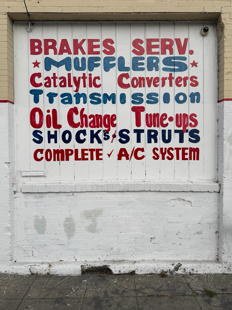
nostr:nprofile1qy2hwumn8ghj7un9d3shjtnyd968gmewwp6kyqpqg8368dx0n6g2c5hdmpak8eukstmgc44v9p5h4am93u3qeanrqdzqejqecv Nice, quirky. I like the bits of serif on the r and C letters, and what I first thought was a minimalist ampersand between shocks and struts. I think it's more of a fancy / though. Whate...
Johannes López Ayala · 36w
nostr:nprofile1qy2hwumn8ghj7un9d3shjtnyd968gmewwp6kyqpqg8368dx0n6g2c5hdmpak8eukstmgc44v9p5h4am93u3qeanrqdzqejqecv I only saw this screenshot in the feed and was sure I was looking at a nostr:nprofile1qy2hwumn8ghj7un9d3shjtnyd968gmewwp6kyqpqtyysvz9rlv4j4vuqupvnqv0jaa8r3tlkqm8pxfensvt4p75x42zsa8suss r...