
When you’re writing a book on type history, and diving into thousands of specimens, stuff starts to stick out that you may never have noticed before. Here’s a little thread about Flöckinger’s piano and Sternat’s head.
In 1925 Berthold ran a competition in Austria for ads using their typefaces. Results were published in the “Wiener Anzeigen Wettbewerb” booklet of 1925.
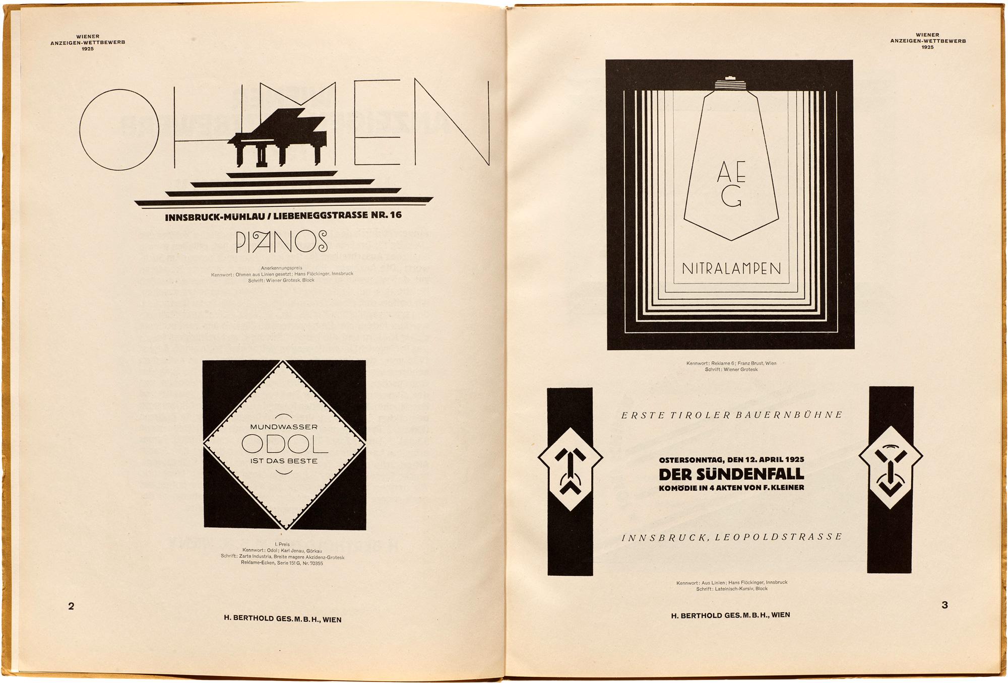
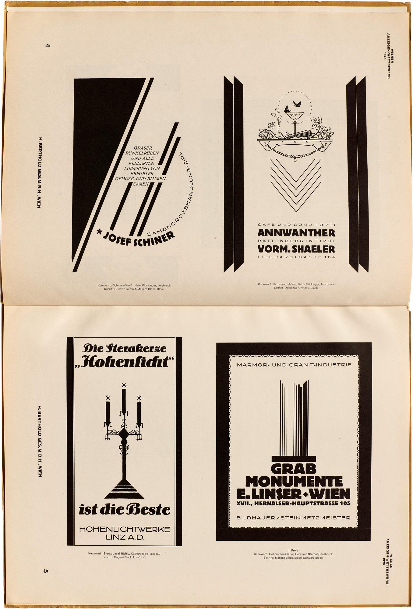
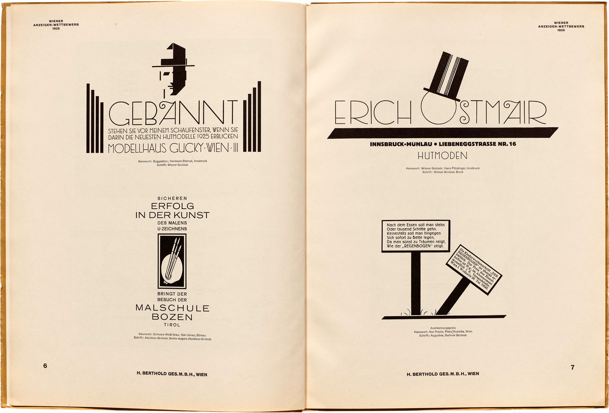
Winners were 1st: Prize Karl Jenau, Görkau in Bohemia (Odol); 2nd: Hermann Sternat, Innsbruck in Tyrol (Brostene Column); 3rd: Josef Richly, Katharein in Schles (HBW). Hans Flöckinger of Innsbruck also got several honorable mentions.
The samples show typefaces like Wiener Grotesk https://fontsinuse.com/typefaces/42287/wiener-grotesk, Block https://fontsinuse.com/typefaces/7572/berthold-block & Akzidenz-Grotesk https://fontsinuse.com/typefaces/76/akzidenz-grotesk in modernist layouts.
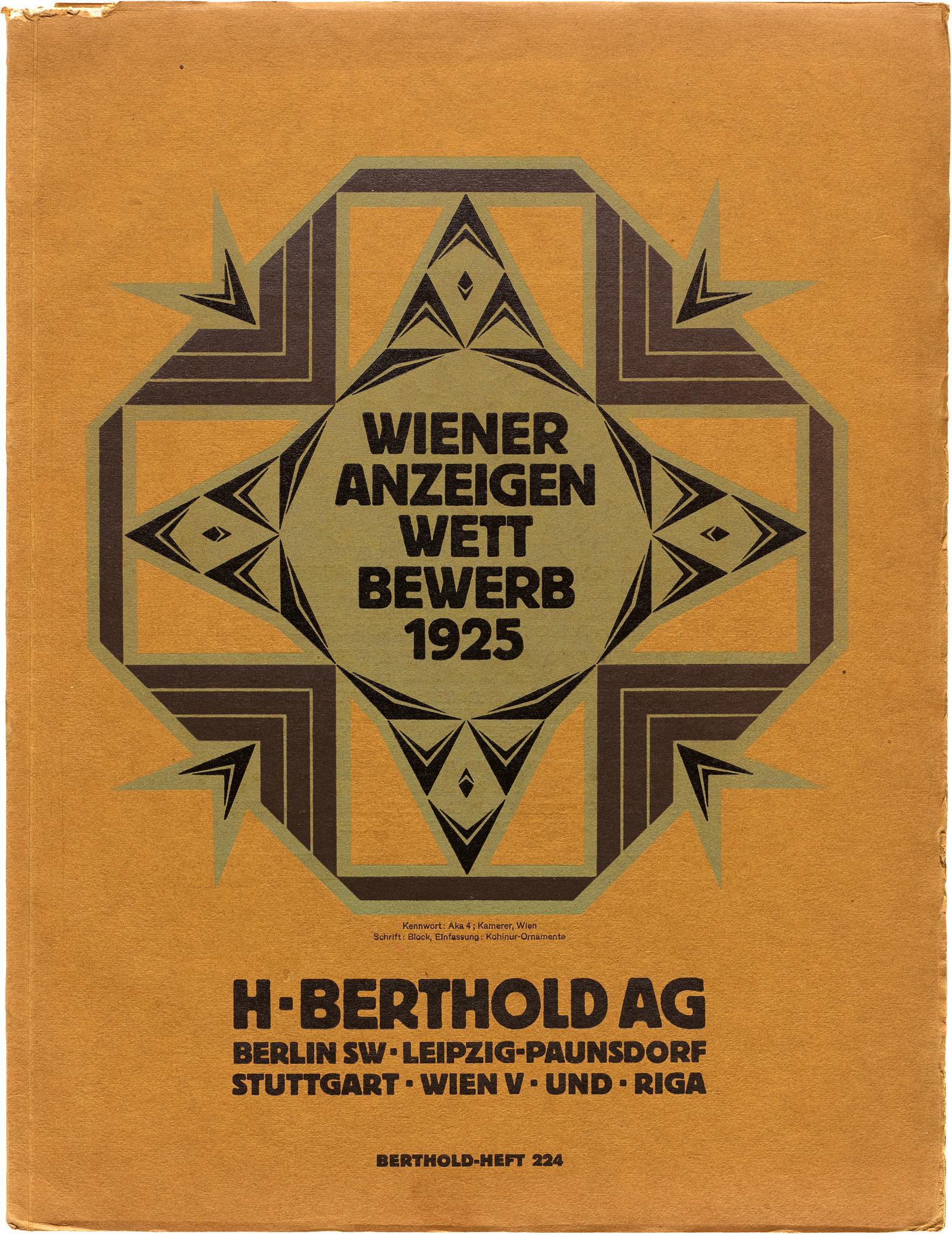
In 1925 Berthold ran a competition in Austria for ads using their typefaces. Results were published in the “Wiener Anzeigen Wettbewerb” booklet of 1925.
Winners were 1st: Prize Karl Jenau, Görkau in Bohemia (Odol); 2nd: Hermann Sternat, Innsbruck in Tyrol (Brostene Column); 3rd: Josef Richly, Katharein in Schles (HBW). Hans Flöckinger of Innsbruck also got several honorable mentions.
The samples show typefaces like Wiener Grotesk https://fontsinuse.com/typefaces/42287/wiener-grotesk, Block https://fontsinuse.com/typefaces/7572/berthold-block & Akzidenz-Grotesk https://fontsinuse.com/typefaces/76/akzidenz-grotesk in modernist layouts.
1